Other Projects
Smaller projects I've worked on.
Personal · Commissions · Since 2015
Smaller projects I've worked on.
Personal · Commissions · Since 2015
The following menus were commissioned by a restaurant in southern Gran Canaria. The client requested A5-sized menus—one with a darker, more elegant style, and the other with a lighter, more casual look. For the second case, two versions were created and ultimately printed and used simultaneously.


The following poster was a commission for a restaurant in southern Gran Canaria. The client requested photographs of each dish and the creation of a poster to be placed at the entrance of the establishment.
For the photos, a white box with a black background and three lights was used. The setup allowed for quick photography of dishes as they came out of the kitchen.
The first version of the poster featured the requested dishes, each with a price tag and flags representing the countries of origin of most of the restaurant’s clientele. The client was not satisfied with the initial design, so a second version was created following their instructions closely, this time including the names of the dishes.


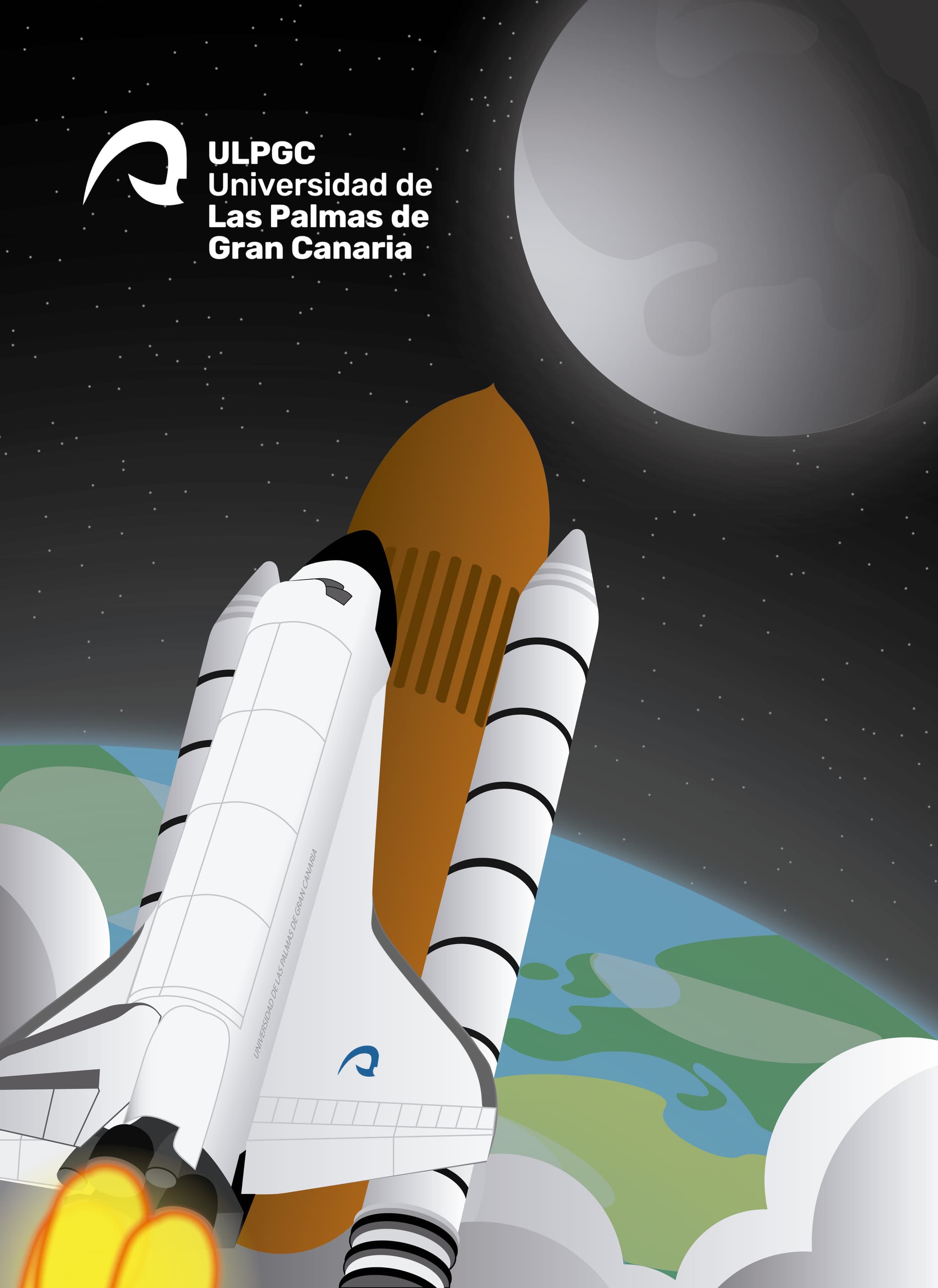
This was my submission for the folder design contest held by the University of Las Palmas de Gran Canaria (ULPGC).

This was a design test I created while exploring ideas for a contest.

After the announcement of Windows 11, I had the idea to create my own folder icons using Microsoft’s new visual language. I explored the possibility of customizing folders and experimented with color variations.


As my first project to learn Affinity Designer, I decided to create a simple vector drawing, and came up with the idea of illustrating a coffee cup.

This design was a concept for how I’d like a hypothetical streaming channel to look. I chose a minimalist approach, building the entire design around electronic circuits and keys. I started by designing a key with the letter 'C', which would later serve as the logo and central element.
Next, I designed the webcam frame, mimicking the chosen perspective and reusing the key design to include the Twitch logo.

Finally, I created three screens: offline, be right back, and starting soon. I reused the key design by changing the letter to build the words and phrases, making the spacebar act as a mechanical switch. The background was filled with a circuit-style pattern.


